


“CRANES FOR CHANGE”
Branding Refresh
Illustration
Client Cranes For Change
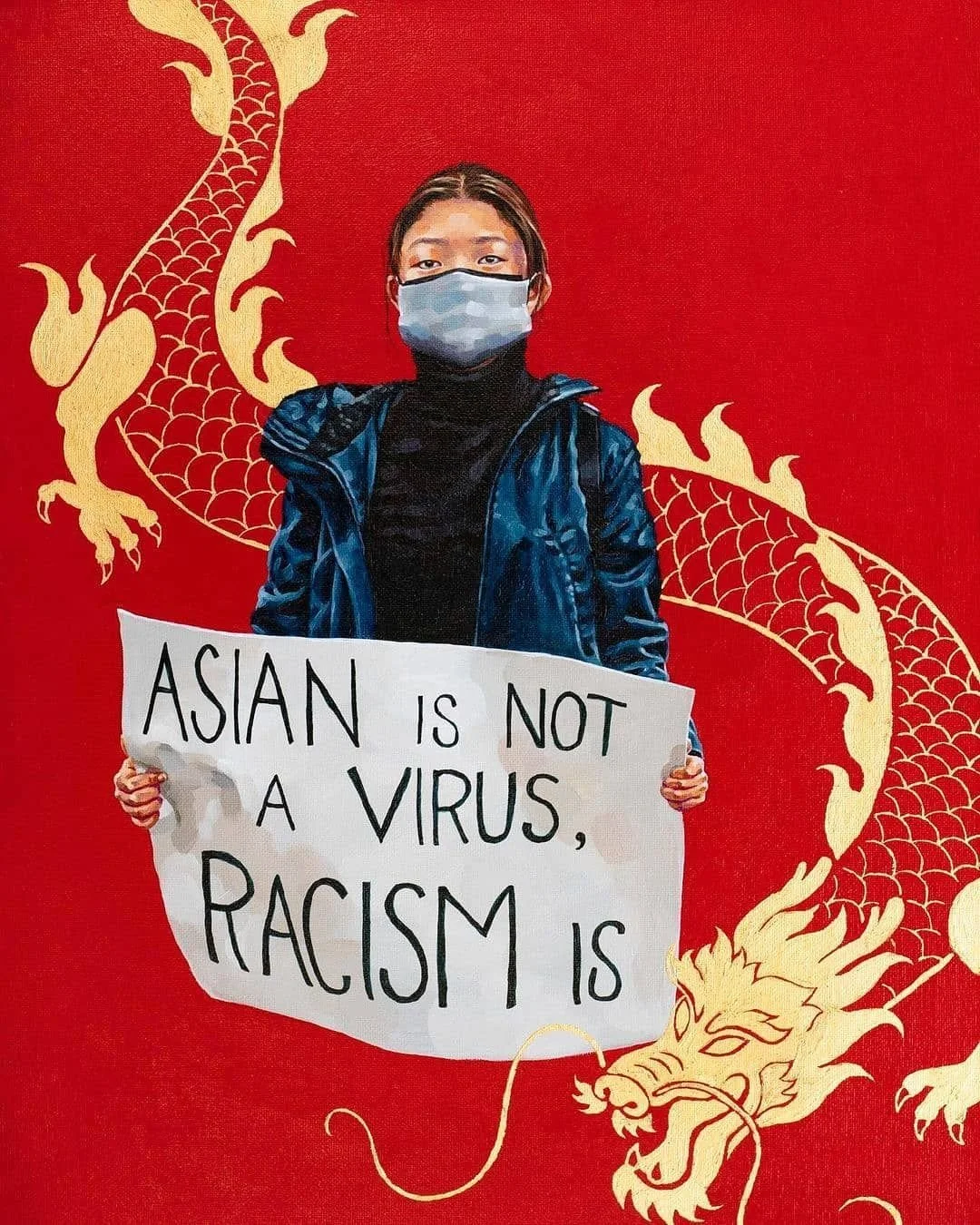
During the height of the COVID-19 pandemic, the Asian-American community faced significant challenges. In response, Kelsey collaborated with a diverse group of creatives to promote her jewelry and amplify her message. When she reached out, I offered to contribute by redesigning her logo by creating an illustration, rather than modeling her earrings. As an Asian-American myself, I felt a strong connection to her mission and was proud to support her efforts in uplifting our community.

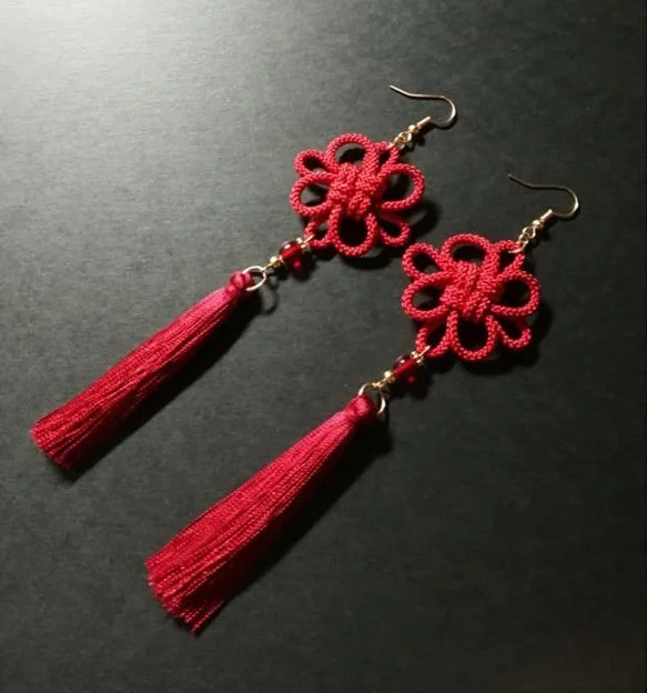
OLD LOGO
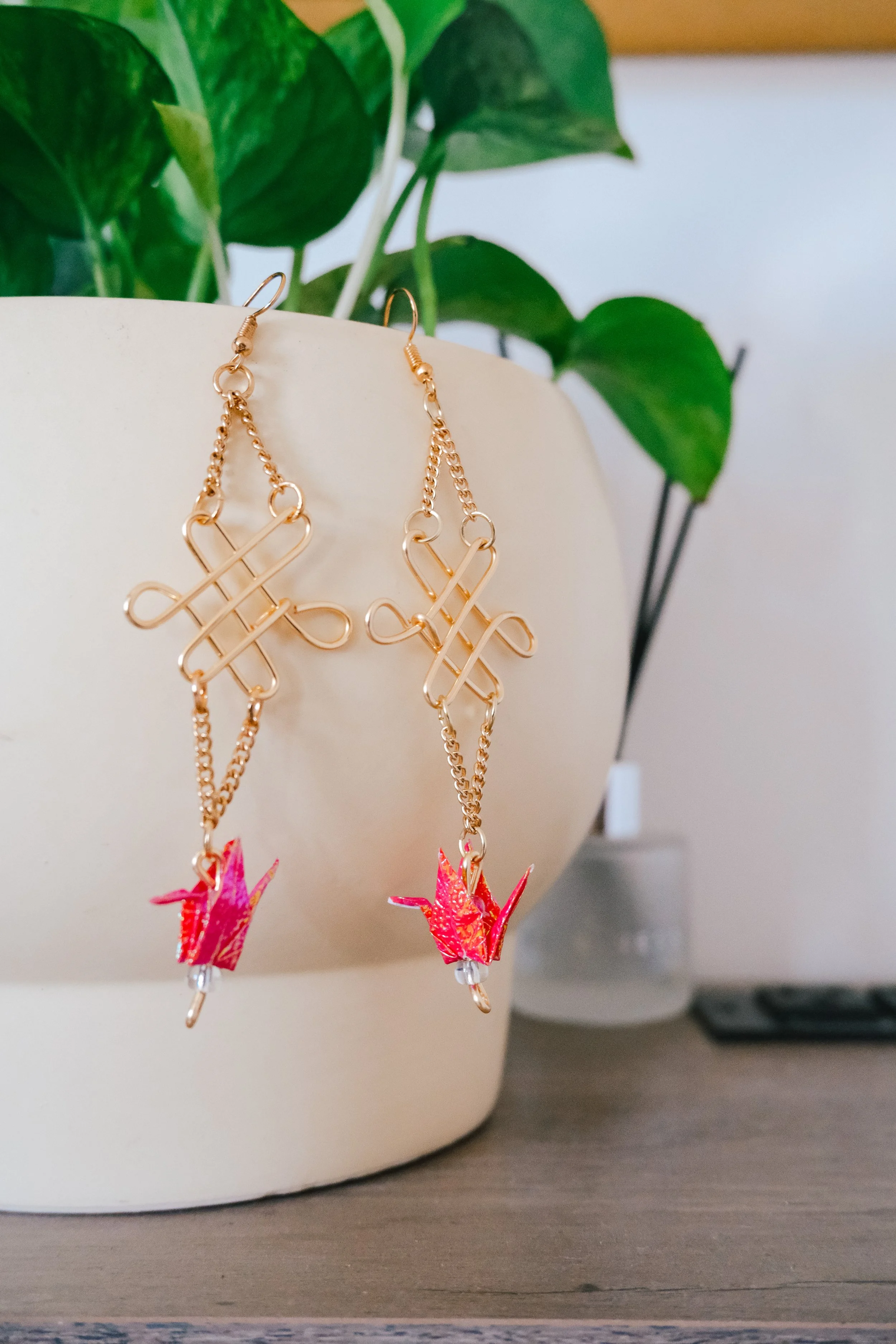
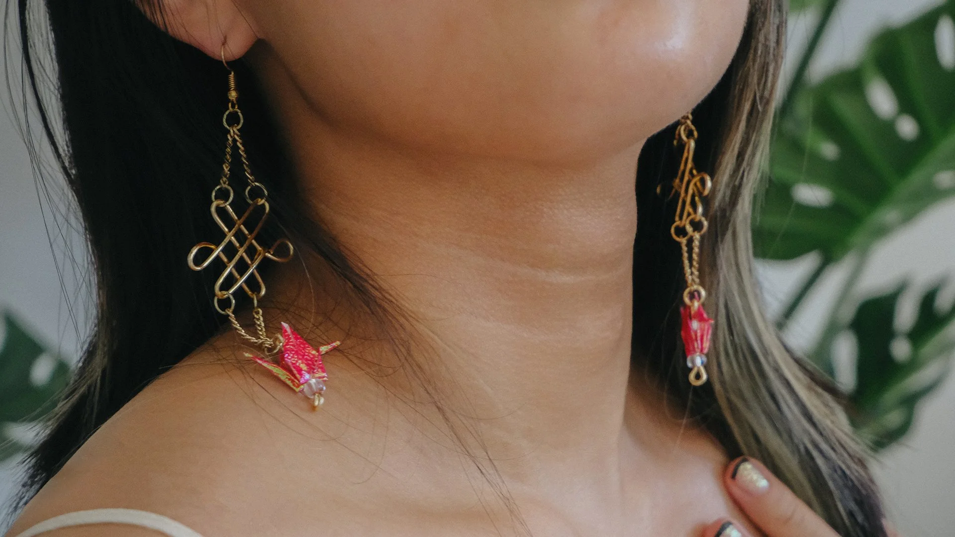
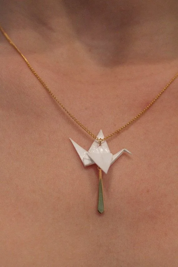
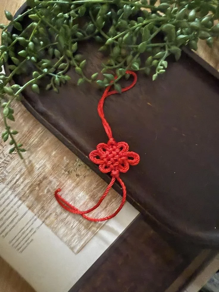
Kelsey expressed a desire for a minimalist approach to the logo redesign, while retaining key elements from the original. Incorporating a crane as the pictorial mark was essential, as it held significance to both her brand and the story behind her products. Additionally, the color red was a meaningful choice, symbolizing her Chinese heritage and its cultural importance.

Utilizing Cranes for Change’s Chinese background, I combined a zhongguo jie (中國結), which is a traditional Chinese single cord knot that is often associated with good luck, prosperity, and happiness along with a Japanese traditional paper crane, Orizuru (折り鶴). The client wanted to incorporate the circle of the original design as well.

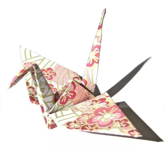


*Inspiration taken from pinterest