

“REDS APPLE”
Re-Branding
Packaging
Print/Digital Media
Product Renders
Client 7 Daze MFG
Lead Designer Kristin Kawasaki
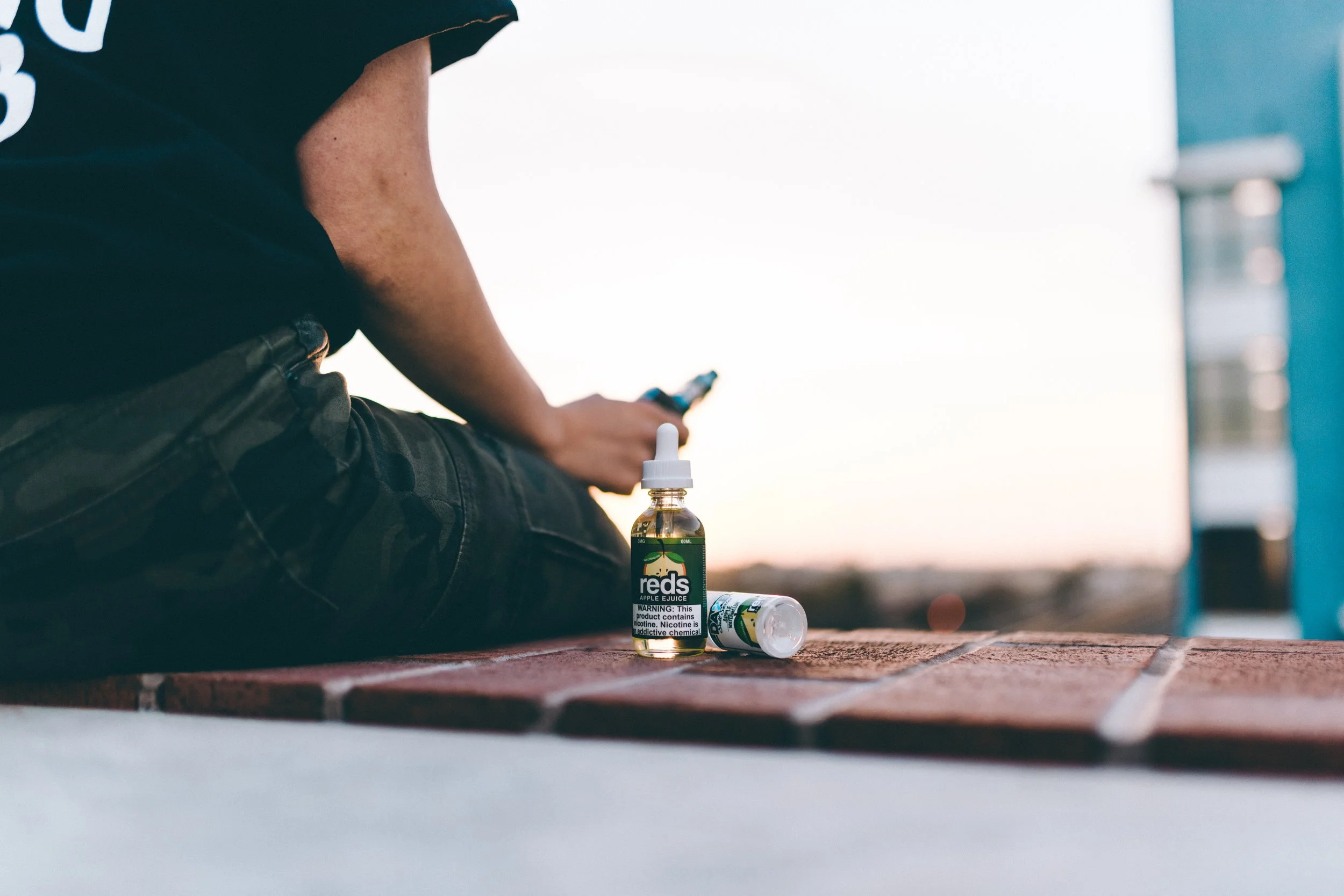
Reds Apple is a well-established vape juice brand that entered the market in 2014, becoming one of the early pioneers in the vaping industry. Over the years, the brand has undergone several evolutions due to changing regulations by creating a unique opportunity for me to contribute to its rebranding and visual direction.
While working with Reds Apple, I helped redefine the brand’s identity and supported the rollout of new marketing assets across both print and digital platforms. This included refreshing visual elements, maintaining compliance with industry standards, and ensuring the brand stayed recognizable while continuing to grow in a competitive space.
CHANGES OVER THE YEARS
2016
The original release packaging of reds apple.
2020
The company has to redesign their packaging due to Appropriate for the Protection of Public Health (APPH) regulations and PMTAs.
2024
Upon getting APPH and PMTA approval, I was assigned lead in the redesign process.
DIELINES
BOTTLE DIELINE
SINGLE BOX DIELINE
10 PACK DIELINE
TRADESHOW
Tasked with arranging the set-up and design of the tradeshow booth, I pitched multiple options via stylescape. The parameters I was given was booth space and budget while working with the CEO to best convey the direction for the brand.